Disney Advertising Rebrand
Client
Disney
Date
© 2025
Categories
Rebrand
About the project
Designing Connection
Through Identity
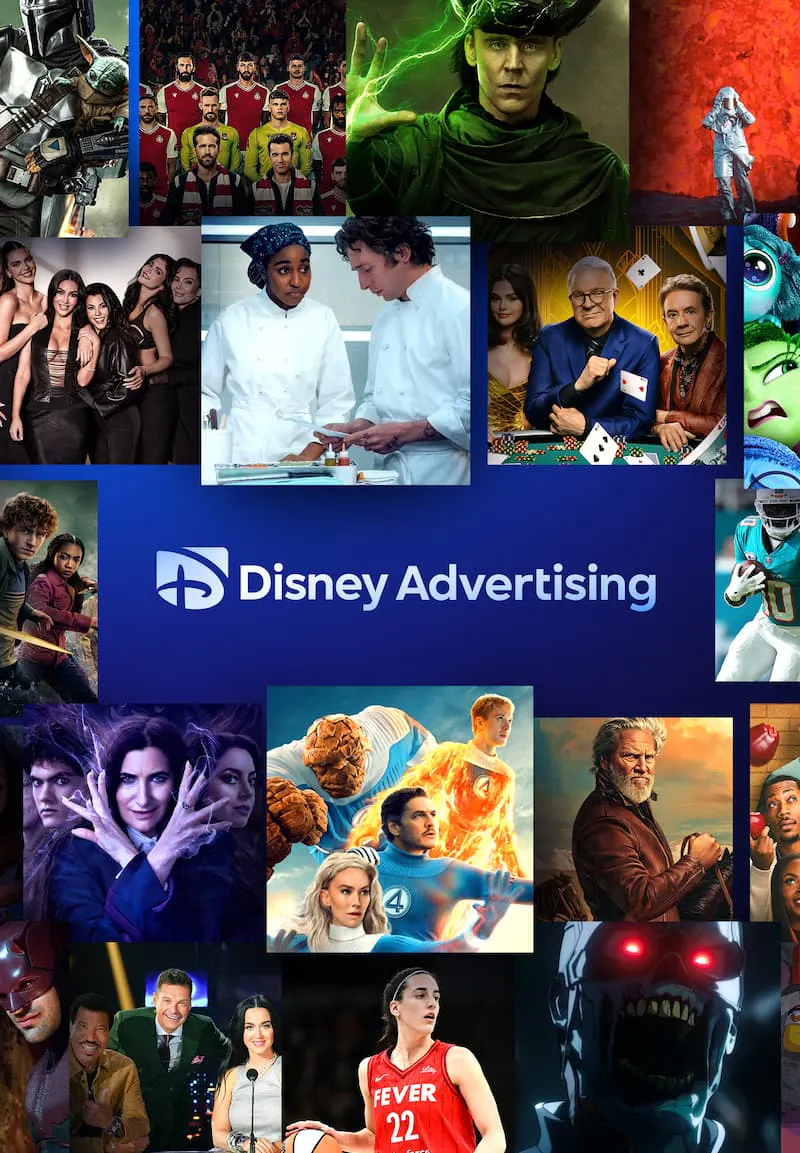
As part of our ongoing collaboration with Disney Advertising, we partnered on a reimagined brand system designed for a new era of Disney+. With Disney, Hulu, and ESPN coming together under one ecosystem, the challenge was creating a visual language that could unify distinct identities without losing what makes each one recognizable. The result is a system built around motion, light, and storytelling, where every element works together while allowing each brand to keep its own voice.


About
the palette
Many Stories,
One Signal
Their True Colors
Distinct Voices,
Shared Light
Bringing multiple worlds together doesn't mean making them look the same. Light became the narrative thread that unified the system, acting as a visual language connecting Disney, Hulu, and ESPN under a shared experience. Expressed through "Disney Blue", "Hulu Green", and "ESPN Red", each identity lives within the ecosystem through distinct lighting cues and placements reflected across the Disney "D", allowing every brand to maintain its own presence while contributing to a larger, connected whole.


As the ecosystem expanded, the identity needed to evolve with it. We refined Disney Advertising's visual language & logo into a cleaner, more contemporary vibe, conceived for flexibility across platforms and formats. The goal wasn't reinvention, but evolution: preserving what felt familiar while creating a mark ready for a more connected, multi-brand future.


BRINGING WORLDS
TOGETHER
More than a rebrand, this was an exercise in balance. Creating a system that could evolve, adapt, and scale while preserving the DNA of each platform. A design language shaped by flexibility, powered by storytelling, and crafted to move as seamlessly as the worlds it brings together.

more projects