
FirstKey Homes Website
Client
FirstKey Homes
Date
© 2020
Categories
UX/UI - Strategy
A place to call home
We give our family
of residents a place
to call home.

About the project
Reimagining
FirstKey Homes
For this project, we did a UX/UI redesign for FirstKey Homes' responsive site (for both desktop and mobile). While some parts of the site already existed and just needed a revamp, other sections (the more interactive ones) needed to be designed from scratch.
The overall design needed to be simple and clean, giving priority to functionality and user needs over decorative elements that could mess up the flow of the user journey.
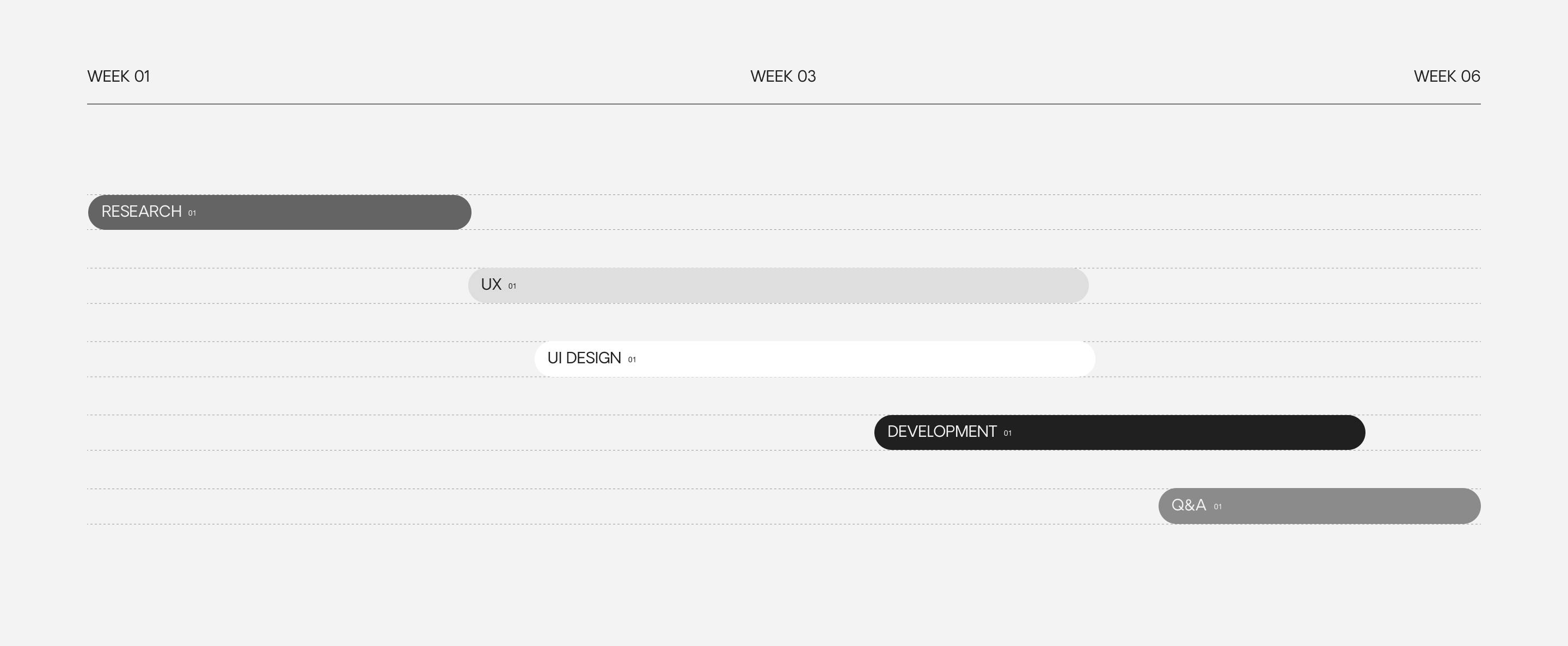
We created a detailed timeline for this project
that covered all of its stages, from ideation to
Q&A and testing.
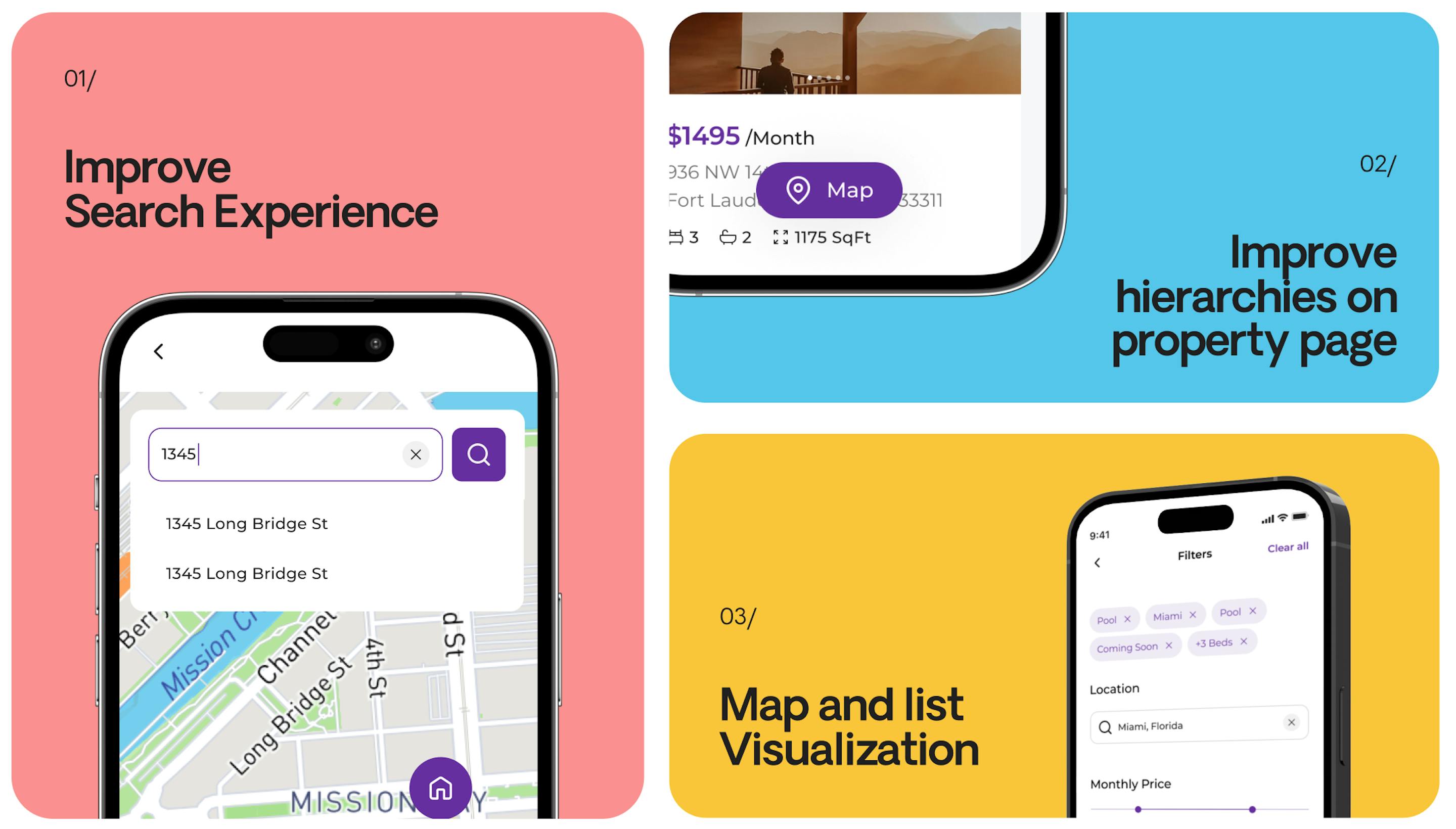
IMPROVED SEARCH EXPERIENCE
Users can create their own personal profiles, upload all their information and have a better, customized experience using the search engine.
MULTIPLE PREVIEWS
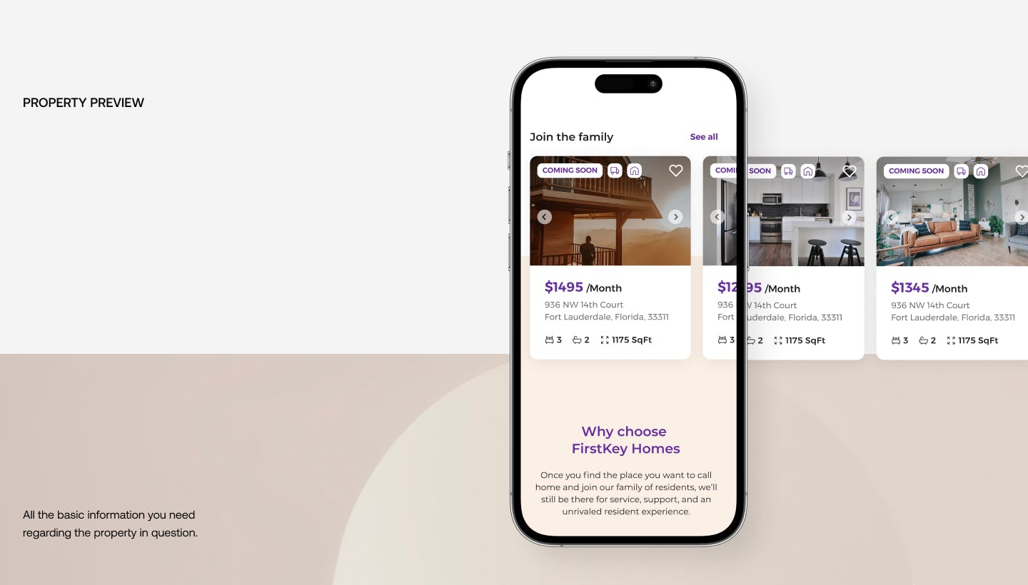
The improvements made to the UX/UI, the search engine and the visualization of the posts resulted in a more friendly process for users overall.
MAP VISUALIZATION
The map visualization makes it easier for users to find the best houses at the best prices in their dream location.
project breakdown
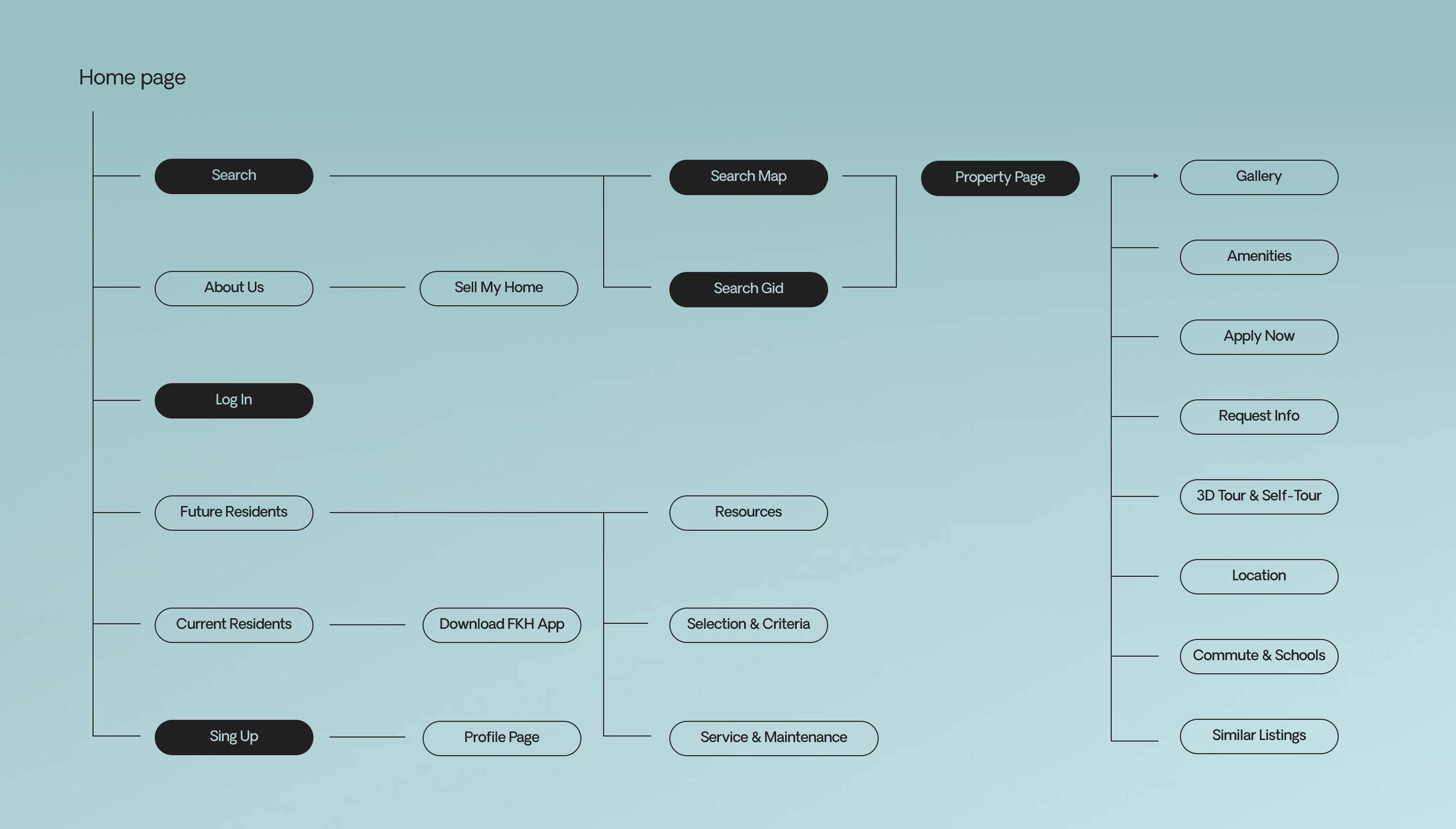
Chart flow
This part of the process was very important, as it gave us a detailed, clear understanding of the existing UX/UI of the site.


project breakdown
Typography
We chose this typeface for its cleanliness and modern look, it's easy to read without being too plain. It's informal but not too informal.
Font Family
Weight
Style

ABOUT THE PROJECT
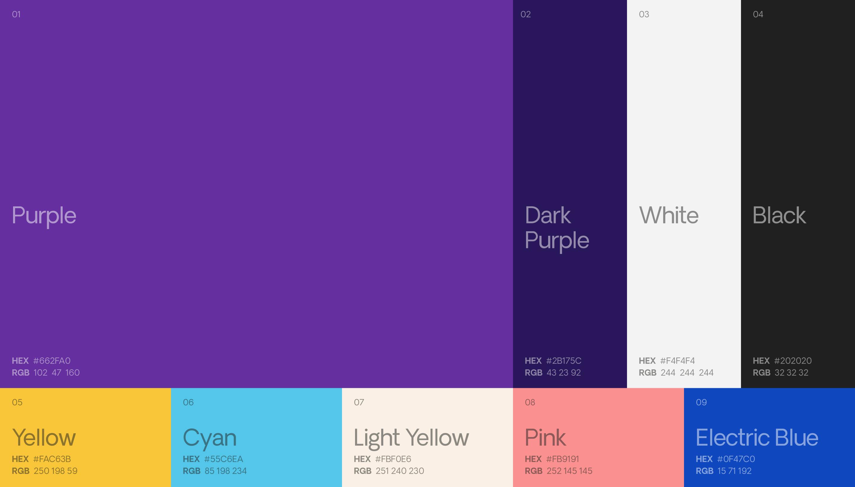
Color Palette
Our color palette is mainly dominated by purple, which is the main color of the brand's logo.
project breakdown
Iconography
We also designed all the iconography seen on the website, using distinctive housing elements that users usually search while renting/buying a home.
Home,
Amenities,
Maintenance
Miscellaneous
& more
All icons match
a color from our
main color palette.
Making of
the grid
General grid for
web & app Icons

project breakdown
Components
& Features
While redesigning the UX/UI for this site, we also did a competitors analysis to better understand the dynamic of this type of platforms and the components that needed to be present.
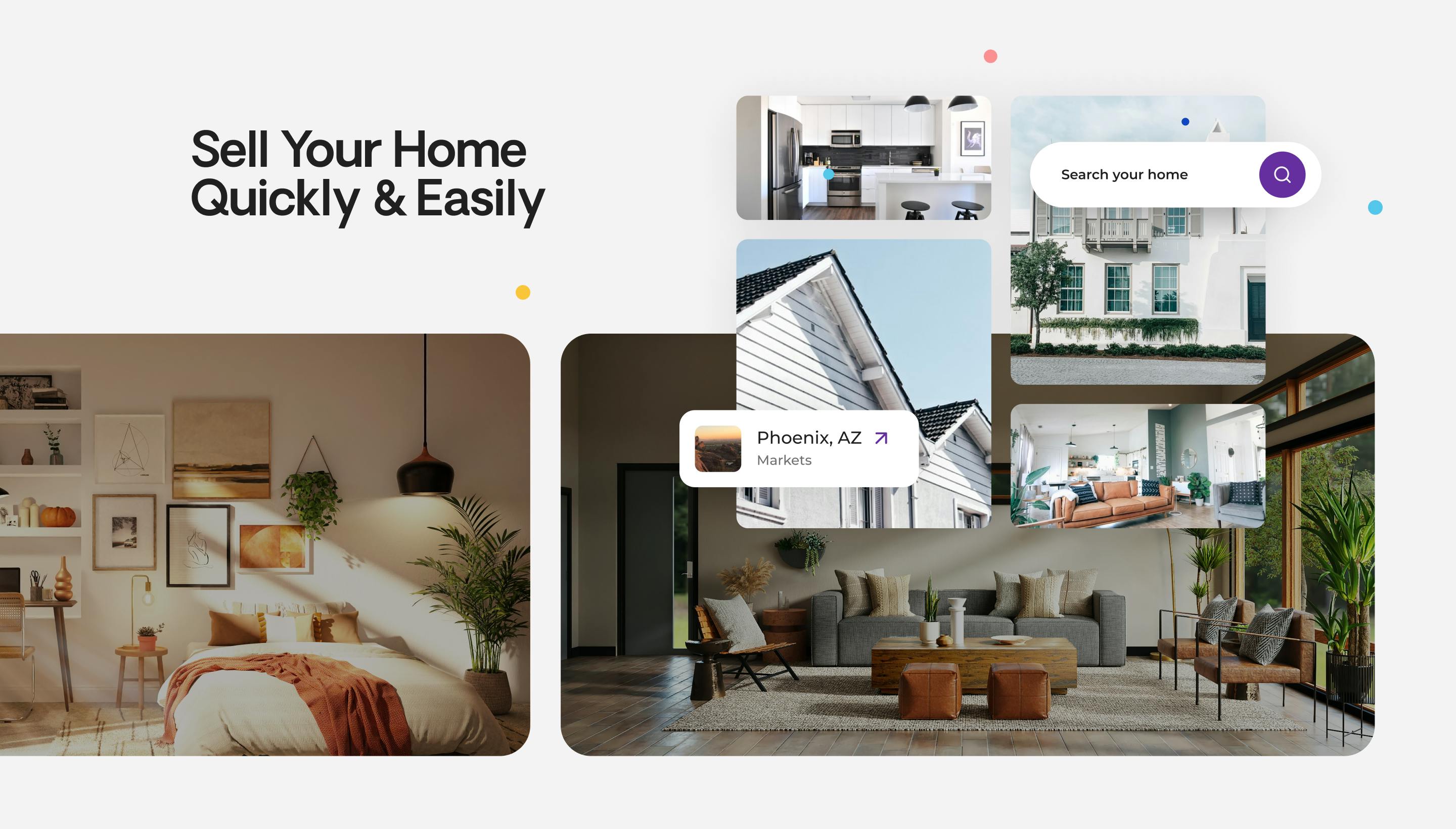
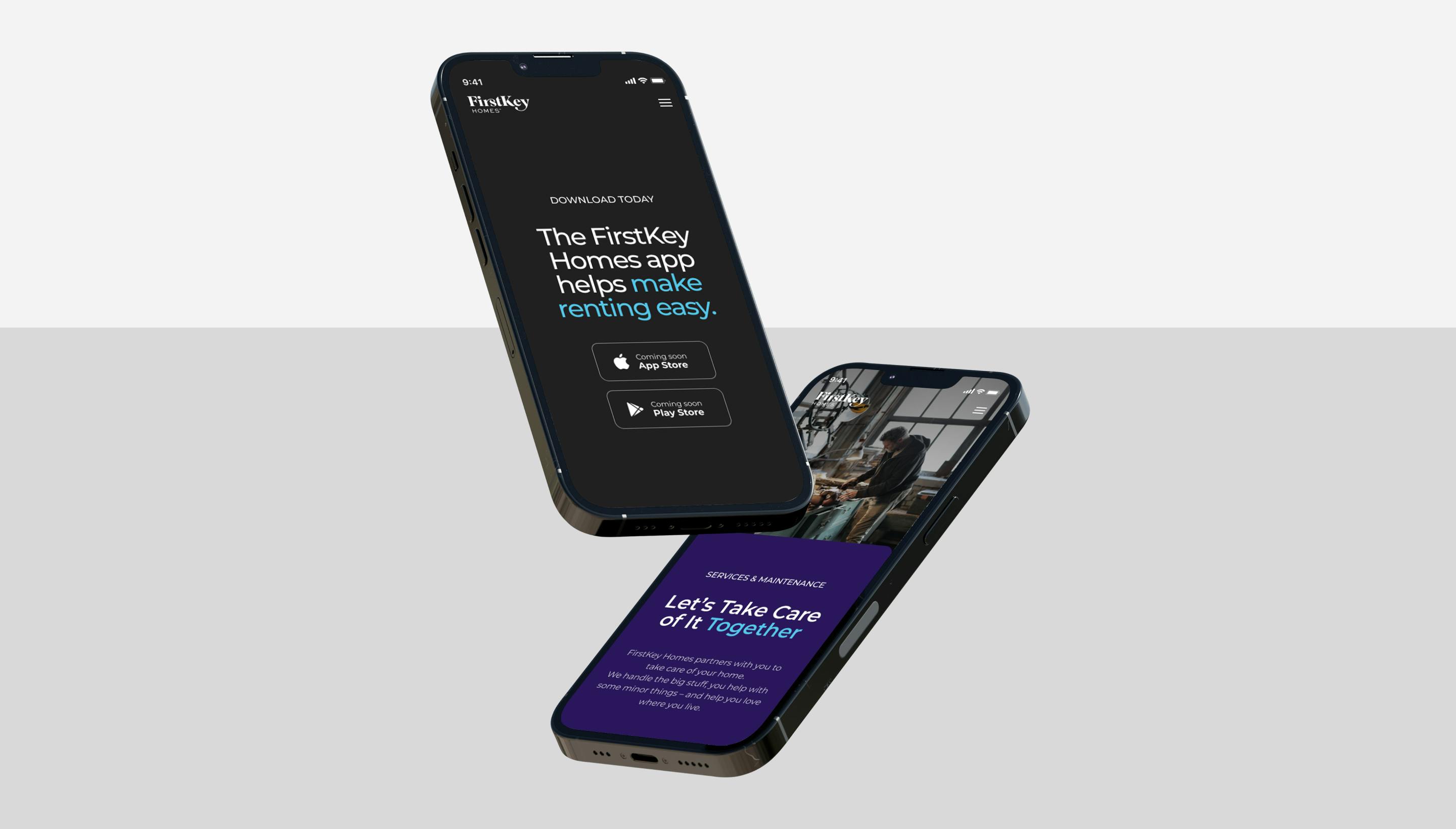
Finding a home 101
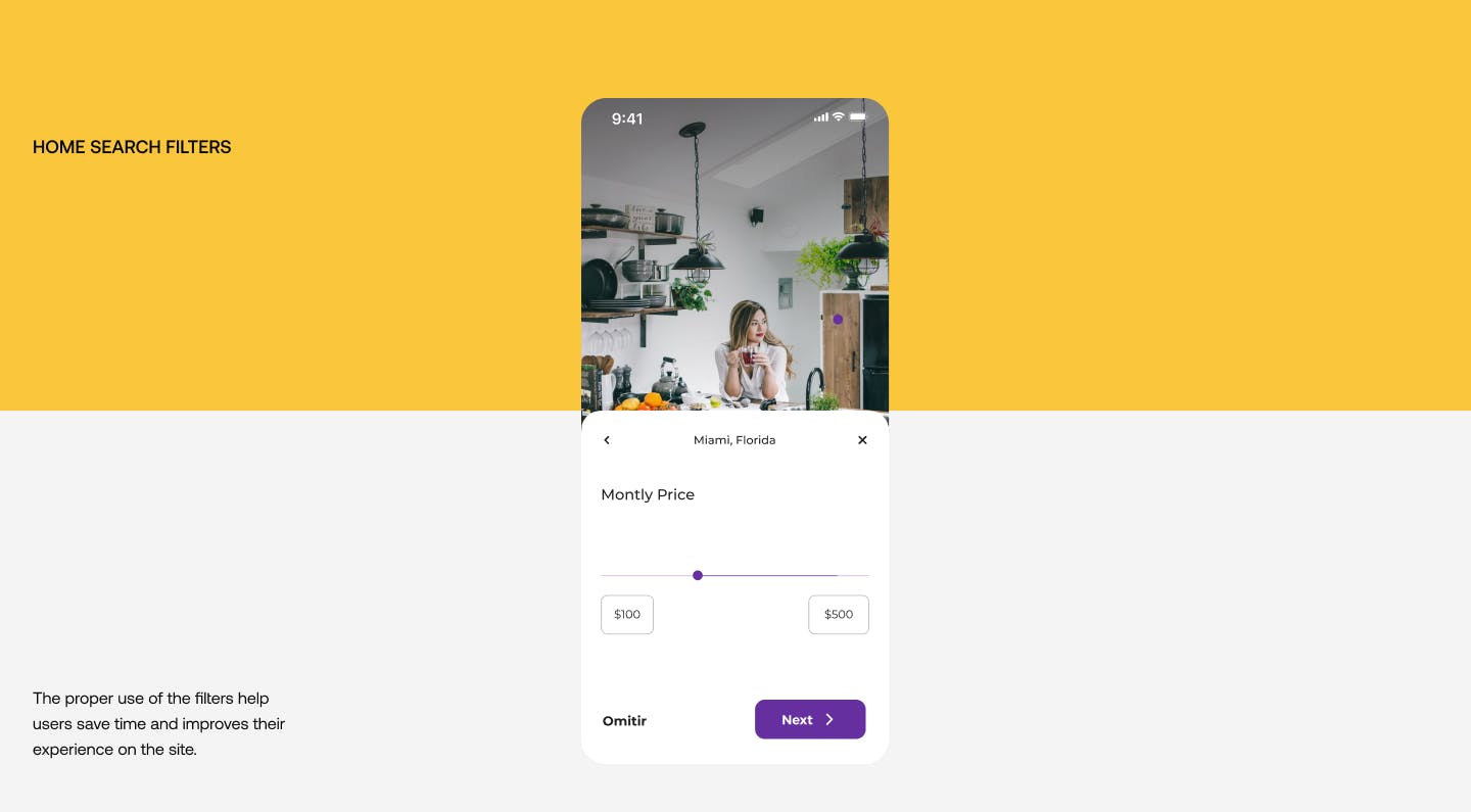
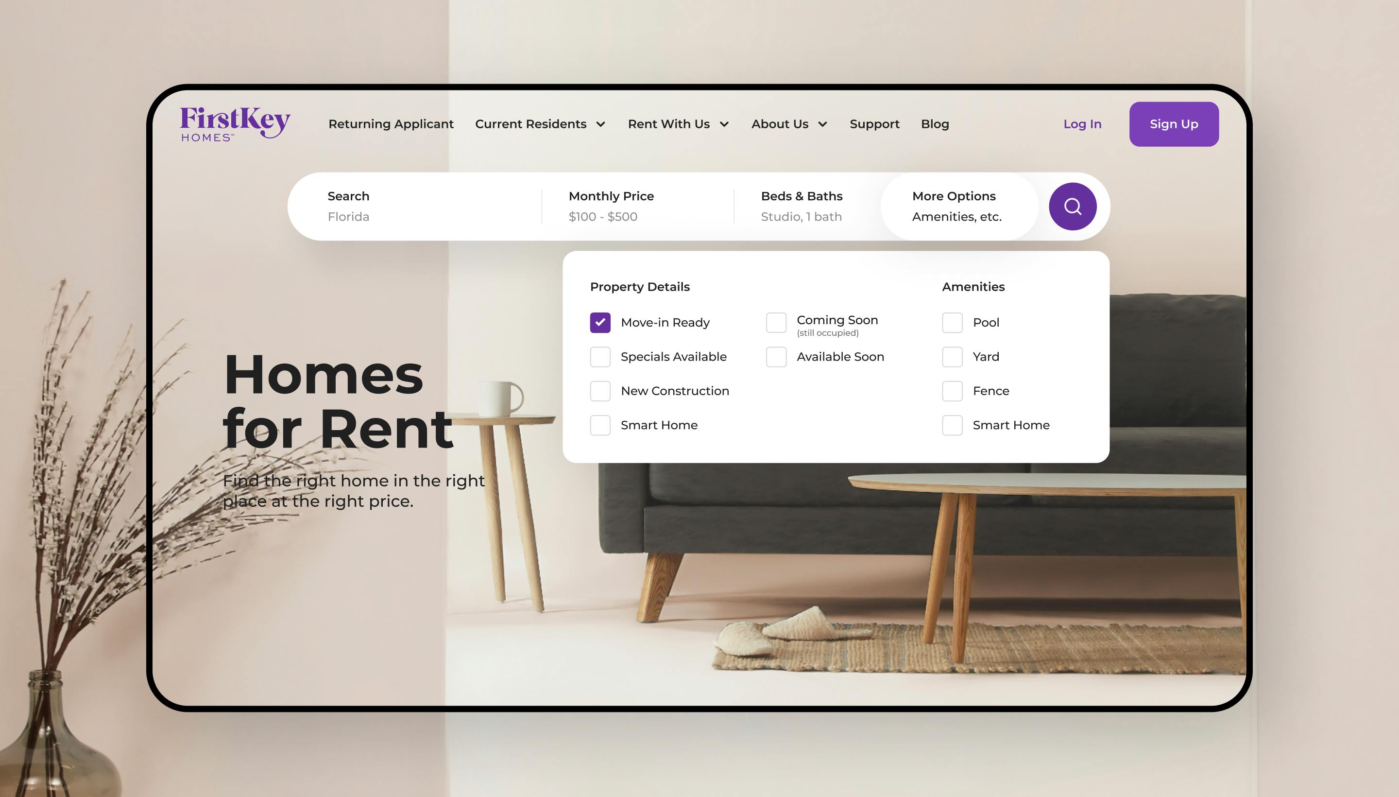
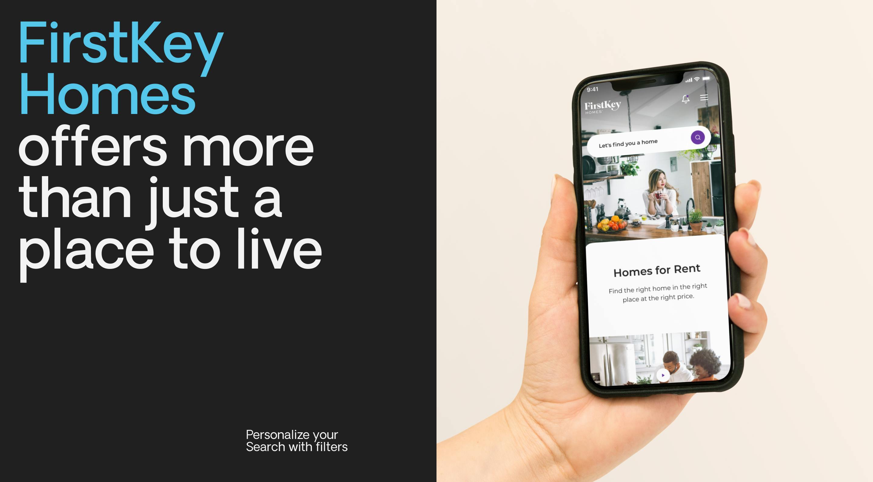
Filter your search
to match your needs
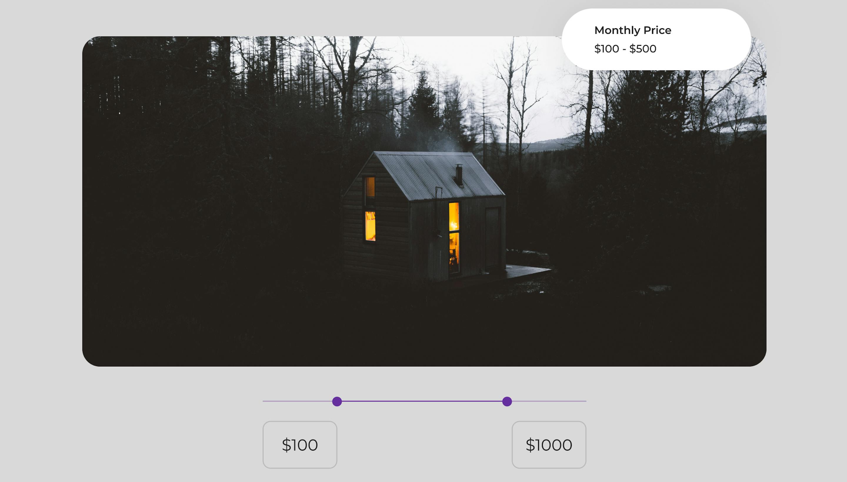
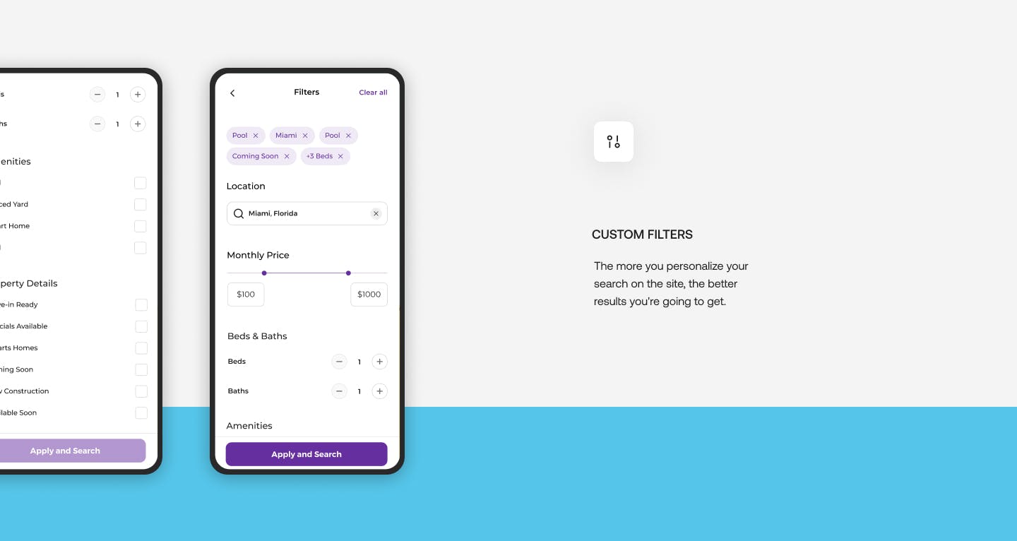
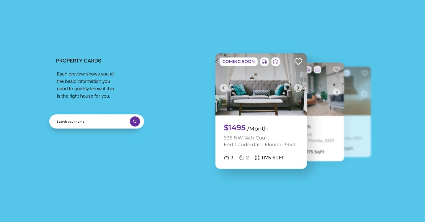
Users can personalize everything in their housing search, from location to cost range, using keywords as well.
features
Search / Filters
Web & App Design
features
UX Components
Web & App Design
features
Scroll Home
Web & App Design

project breakdown
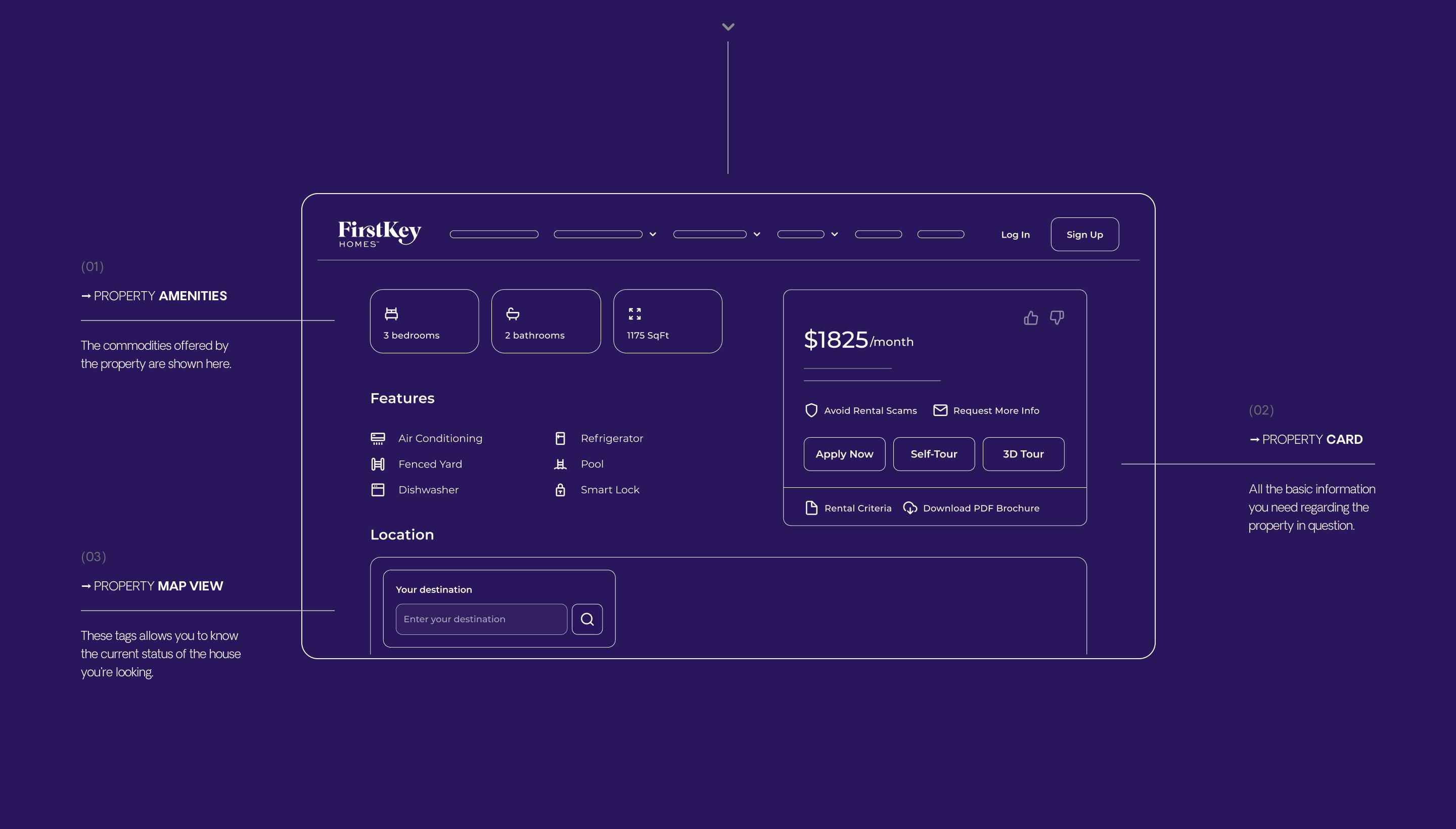
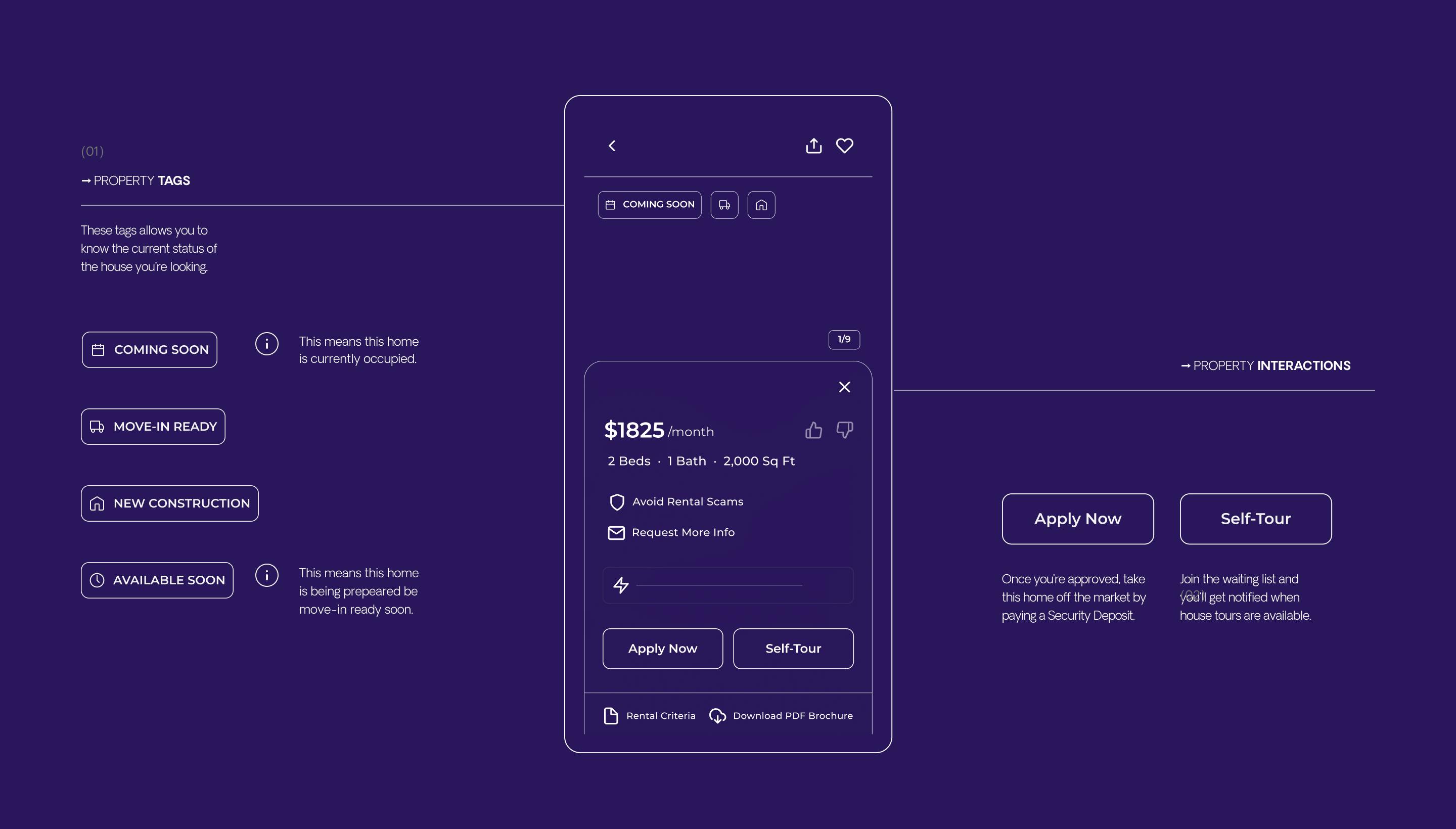
Wireframes
The wireframe design was one of the pivotal stages of this project, and it needed a lot of time, detail, Q&A and testing to be done right.
DESKTOP VIEW
Property Page
Wireframes
MOBILE VIEW
Wireframes

more projects
